How to use Claude + Figma Make for rapid product discovery and prototyping
Product discovery is slow not because founding teams lack ideas. On the contrary, the ideas are usually in abundance and the teams are inspired. But things can get stuck somewhere between “we have an idea, let’s do it” and “we have something to show”.
The traditional path looks like this: a founder has an idea, briefs a Product Manager, who books a discovery workshop, which produces a document, which gets handed to a UX designer who creates prototypes, which go into stakeholder review – and by the time anyone has seen something tangible, weeks have passed, and the context or even the market has shifted.
For early-stage products, that timeline isn’t just frustrating, it’s a competitive disadvantage. The longer the gap between an idea and a functional prototype, the more decisions get made based on assumptions rather than real user feedback.
How do you close this gap and accelerate product discovery?
We recommend “vibe prototyping” – it’s like vibe coding but with a less catchy name.
This tutorial walks you through an end-to-end workflow using Claude and Figma Make. Claude handles the product discovery: requirements, personas, user stories, constraints. Figma Make handles the prototypes: turning a precise description into a working prototype frame.
Using this workflow, a founder can run a discovery sprint in a day that would normally take a 3–4 person team a fortnight.
Let the vibes carry us!
Table of Contents
The workflow: What each tool actually does
Before diving into the prompts, it’s worth being precise about the division of labour, because most people who try this workflow use it backwards.
Claude’s job is structured thinking. Given a raw product idea, Claude can produce a scoped PRD, user personas, prioritised feature lists, acceptance criteria, competitive framing, and a set of open questions that need stakeholder decisions. It can do this in minutes. What it can’t do is show you what the product will looks like.
Figma Make’s job is visual generation. Given a precise description of a screen, e.g. the frame size, navigation pattern, component names, UI states, and realistic placeholder data, it produces a Figma frame you can share and iterate on. What it can’t do is decide what to put on the screen in the first place.
The bridge between Claud and Figma Make is the key insight of this workflow. Claude’s output, particularly user stories with their implied UI states, is the raw material for Figma Make prompts. You don’t need to rewrite anything; you need to translate it. And Claude can do the translation too.
Brief Claude with your idea
One paragraph. Product, audience, core problem, rough constraints.
Get back a PRD and user stories
Structured requirements with UI state implications built in.
Ask Claude to translate stories into Figma Make prompts
One per screen. Self-contained and ready to paste.
Run prompts in Figma Make
Generate frames, refine with follow-up prompts, copy as design layers.
Review, feed decisions back to Claude/Figma
Update PRD, generate the next round. Repeat.
What this workflow doesn't replace
-
User research
A prototype built on assumptions is still built on assumptions. This workflow helps you validate faster, it doesn't do the validation. You still need real users, real feedback, and the humility to throw away what doesn't work.
-
Engineering feasibility
Figma Make generates screens that look buildable. That's not the same as screens that are buildable with your stack, timeline, and team. Involve engineers before a prototype becomes a brief.
-
Actual design decisions
Component selection, visual hierarchy, accessibility, interaction design — these require a designer's judgment. Figma Make accelerates the process; it doesn't replace the craft.
-
Stakeholder alignment
A prototype is a starting point, it's not something built-in-stone. The workflow gets you to the table faster with something concrete, but the hard work of alignment is still human.
The goal isn’t to remove humans from product discovery. It’s to compress the time between an idea and something worth having a human conversation about.
Step 1: Brief Claude
Start with a single paragraph. Don’t worry about formatting it correctly: the prompt below will do that work. The only things Claude needs upfront are: who the product is for, what problem it solves, and any hard constraints you’re working within.
Here’s an example brief for a fictional product: a mobile-first driver check-in tool for small logistics companies.
Claude prompt – requirements brief
					I'm building a B2B SaaS product for small logistics companies (5–50 drivers). The core problem: dispatchers waste 2+ hours per day chasing driver status updates by phone.

Help me write a Product Requirements Document for a mobile-first driver check-in feature. Include:
— Problem statement and user personas (dispatcher + driver)
— Core feature requirements (must-have for v1 only)
— What's explicitly out of scope
— 3 open questions for stakeholder review

Format with clear headings. Be specific and direct — no generic filler.
What you get back: a structured PRD with defined personas, a prioritised feature list, clear scope boundaries, and flagged decisions that need human input before anything gets designed. That last part matters because Claude can surface the ambiguities your brief left implicit, which is exactly what a good PM does in a discovery workshop.
From there, you can iterate. Ask Claude to add acceptance criteria for each feature, or to rewrite the scope. The PRD becomes a living document you shape through conversation rather than a blank page you fill from scratch.
Tip: Add your competitive context to the brief
Name your competitors in the brief, even just “our closest competitors are X and Y, here’s what they do well and badly.” Claude will use it to sharpen what makes your app worth building.
Step 2: Generate user stories
Most AI-generated user stories are useless for design work because they stop at the action: “As a dispatcher, I want to see driver status.” That tells you what the user wants to do. It doesn’t tell you what the UI needs to show, what states it needs to handle, or what happens when something goes wrong.
The fix is to ask Claude for one more field: the UI state this story implies. This is the bridge between documentation and design. It’s written in language Figma Make can directly act on.
Claude prompt — user stories with UI state
					Using the PRD above, generate user stories for the dispatcher persona only.

For each story, use this format:
As a [dispatcher], I want to [action] so that [outcome].
Acceptance criteria: [2–3 specific, testable conditions]
UI state this implies: [what the screen needs to show, including edge cases]

Cover these scenarios:
— Viewing real-time driver status across all active routes
— Sending a manual check-in request to a specific driver
— Handling a driver who hasn't checked in after 30 minutes

Flag any story where the UI state is ambiguous or requires a stakeholder decision before it can be designed.
The “UI state this implies” field is doing real work here. For the overdue driver scenario, it forces an explicit decision: is the overdue state a warning (amber), an error (red), a modal alert, a push notification, or all of the above?
Ask Claude to sort stories by design complexity, simplest first. This sequences your Figma Make sessions so you start with screens that will render cleanly and build confidence before you tackle the harder edge cases.
Step 3: Transform requirements into Figma Make prompts
This is the step most teams skip, and it’s why their Figma Make output looks generic. There’s a specific vocabulary that Figma Make responds to: device/frame dimensions, navigation patterns, component names from your design system, UI states, and realistic placeholder data. PRD language doesn’t use that vocabulary. Figma Make prompt language does.
Since Claude already has the PRD context, you just need to tell it what format to produce.
Claude prompt — convert requirements to Figma Make prompt
					Convert the PRD and user stories into Figma Make prompts.

The app uses iOS 26 component library. Primary device: iPhone 16.

The Figma Make prompt should specify:
— Exact frame dimensions and OS
— Navigation bar or tab bar layout and which tab is active
— Each UI element by component name
— 6 rows of realistic placeholder data: driver names, current locations, last check-in time, status (on-route, checked-in, overdue)
— Visual treatment for the "overdue check-in" state: use error container colour, trailing badge showing "30 min overdue"
— The bottom sheet or action menu that appears when a row is tapped
— An empty state for when no drivers are currently active

Write it as a collection of single, self-contained prompts I can paste one after another directly into Figma Make.
The output is paste-ready. Run it in Figma Make with your design system library connected and you’ll get a frame that uses your actual components and brand colours.
Run a prompt for each key screen in your user story set: home/dashboard, detail view, empty state, error state, and any onboarding or setup flows. Each generates one Figma Make prompt, each produces one reviewable frame.
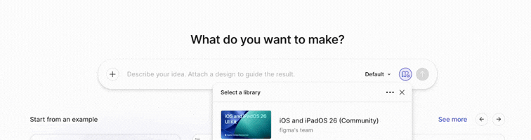
Connect your design system library
Before you start: Open Figma Make and connect your design system library first. If you’re starting from scratch, Apple’s iOS 26 UI kit or Google’s Material 3 kit are both available in the Figma Community and work well with the component-name approach above.
Step 4: Generate, review, and iterate
Paste your Claude-generated prompt into Figma Make. First generation is rarely final, and it shouldn’t be. The value isn’t in the first output; it’s in the speed of the second and third iteration.
The critical discipline here: use follow-up prompts to change specific elements rather than regenerating the whole screen. Figma Make handles incremental refinement well. It handles full regeneration less consistently.
When you have frames you’re happy with, use “Copy as design layers” to transfer them into your main Figma file, not screenshots. Screenshots are dead objects. Design layers are editable, which means the designer or developer who picks this up next can work with the actual components rather than recreating them.
At this point, you have a reviewable prototype. Share it. The goal of a prototype is to make further decisions. So before moving forward, be explicit about what decisions this prototype is being used to make.
Figma Make prompt
					You are designing RouteCheck — a B2B iOS app for small logistics companies (5–50 drivers) that lets dispatchers monitor driver check-ins in real time.

DESIGN SYSTEM:
Use Apple's official iOS & iPadOS 26 UI Kit exclusively. Apply the Liquid Glass design language throughout: translucent materials, frosted glass surfaces, vibrancy effects, updated iOS 26 corner radii, and system colours. Reference component names precisely as they appear in the kit.

APP TINT COLOUR: #1A5FD6 (deep blue). Use as the app's accent/tint across buttons, links, and selected states.

PERSONAS:
- Dispatcher (Maya Chen): office or mobile, monitors all active routes, acts on overdue check-ins.
- Driver (James Okoye): mobile-first, submits check-ins, views their own route only.

DEVICE & LAYOUT:
Primary device: iPhone 16 Pro (393 × 852pt @3x). Respect Dynamic Island safe area at top and home indicator at bottom. Use SF Symbols for all icons. Bottom navigation: 4-tab UITabBar with Liquid Glass material (dispatcher view). Driver view uses 3-tab UITabBar.

STATUS SYSTEM (apply consistently across all screens):
- On route: blue tinted pill — SF Symbol: location.fill
- Checked in: green tinted pill — SF Symbol: checkmark.circle.fill
- Overdue: red tinted pill + trailing badge — SF Symbol: exclamationmark.circle.fill
- Off duty: grey tinted pill — SF Symbol: moon.fill

TYPOGRAPHY: SF Pro Display for large titles and hero text. SF Pro Text for body and supporting text. SF Mono for times, distances, and numeric values. Follow iOS 26 Dynamic Type scales.

PLACEHOLDER DATA: Company name: Hartwell Logistics. Dispatcher: Maya Chen. Use realistic UK logistics driver names and route names throughout.

TONE: Professional, utility-first, clear at a glance. Safety-critical information (overdue drivers) must be immediately legible.
Voila!
Here is a preview of the RouteCheck iOS app generated with Claud + Figma Make using the workflow from this guide.
Step 5: Feed prototype feedback back into Claude
Stakeholder review of a prototype surfaces things no document ever would. Someone will point at a screen and say “we need this action available here, not there” or “that threshold should be configurable” or “we need a bulk-select mode.”
Capture those decisions and feed them back to Claude. It has the full PRD context and can update the documentation, close the open questions, and generate the next round of Figma prompts.
This is the loop: Brief → requirements → stories → prompts → prototype → feedback → updated requirements → new prompts → new prototype. Each cycle takes hours, not weeks. Each cycle produces something more accurate than the last. And at the end of it, before a single line of code has been written, you have a documented set of requirements and a visual prototype that has been reviewed by stakeholders.
That’s the accelerated discovery process. It used to take a fortnight, now it takes a day and a prompt (or two).
The ultimate goal is better decisions, sooner.
The reason to compress discovery isn’t necessarily to ship faster, it’s to be wrong (or hopefully right) faster. The faster you have something to look at, the faster you find out what’s right and what isn’t. Product requirements documents defer that moment. Prototypes accelerate it.
Running a product discovery sprint?
At Fractional Teams, we work with founders and B2B product teams to accelerate discovery, sharpen requirements, and get to validated prototypes faster. If you’re building something and need experienced hands for the early stages, we’d like to hear from you.

Kateryna Novozhylova
Hi! I'm Kateryna Novozhylova, co-founder at Fractional Teams. I write about product, marketing and tech.